Snapsight AI
Website Redesign
Snapsight was sitting on a breakthrough AI product but their website was still telling the old story. We led a full redesign — new visual identity, design system, and conversion-optimised UX copy — that helped them close a 125% annual sales increase.
Visit liveThe Brief
Snapsight AI had evolved significantly — from a post-event survey tool to a full AI-powered event intelligence platform. But their website still read like the old product. Enterprise buyers visiting the site were confused about what Snapsight actually did, and the demo request flow had a drop-off problem the team had been tolerating for months.
The ask was end-to-end: new positioning, a visual refresh, a scalable design system, and handoff-ready specs. Eight weeks, shipped.
Our product is genuinely category-defining now. Our website makes us look like a 2019 startup.
— Snapsight CEO
We led the project end to end, collaborating with Snapsight's marketing lead on messaging and their dev team for implementation review and the Framer build.
Success looked like: a website that instantly communicated the AI value proposition to an enterprise EventTech buyer, drove more demo requests, and could be maintained and extended without us.
Research & Strategy
Competitor Audit
Mapped 8 direct and adjacent competitors across EventTech and AI analytics. Identified gaps in how they communicated AI-specific trust signals to enterprise buyers.
Analytics Deep-Dive
Reviewed 6 months of GA4 and Hotjar data. Found that 71% of organic visitors left from the homepage without scrolling past the fold — a clear hierarchy problem.
Stakeholder Interviews
Ran 5 interviews with the sales team to understand what objections came up most in demos, then designed the website to proactively address them.
Design Decisions
Positioning the AI Value Above the Fold
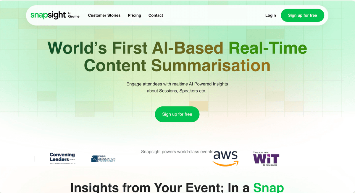
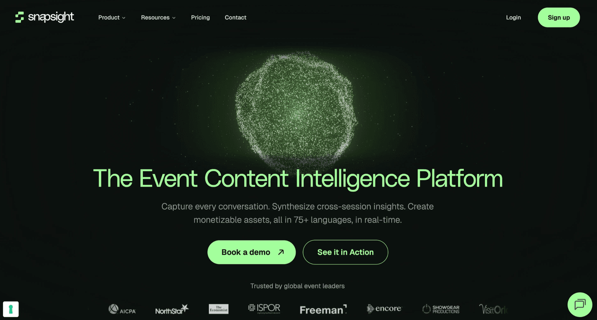
The original homepage opened with a generic tagline about "event insights." We restructured the hero to lead with the AI-specific outcome — what changes for the buyer after using Snapsight. The new headline tested significantly better in copy testing: clarity score up from 4.1 to 8.6/10 with target users.
Visual Identity: From Generic SaaS to AI-Native
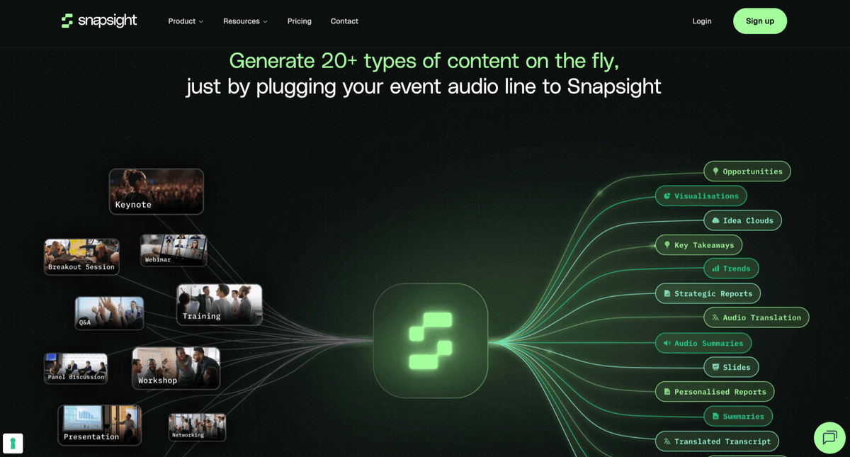
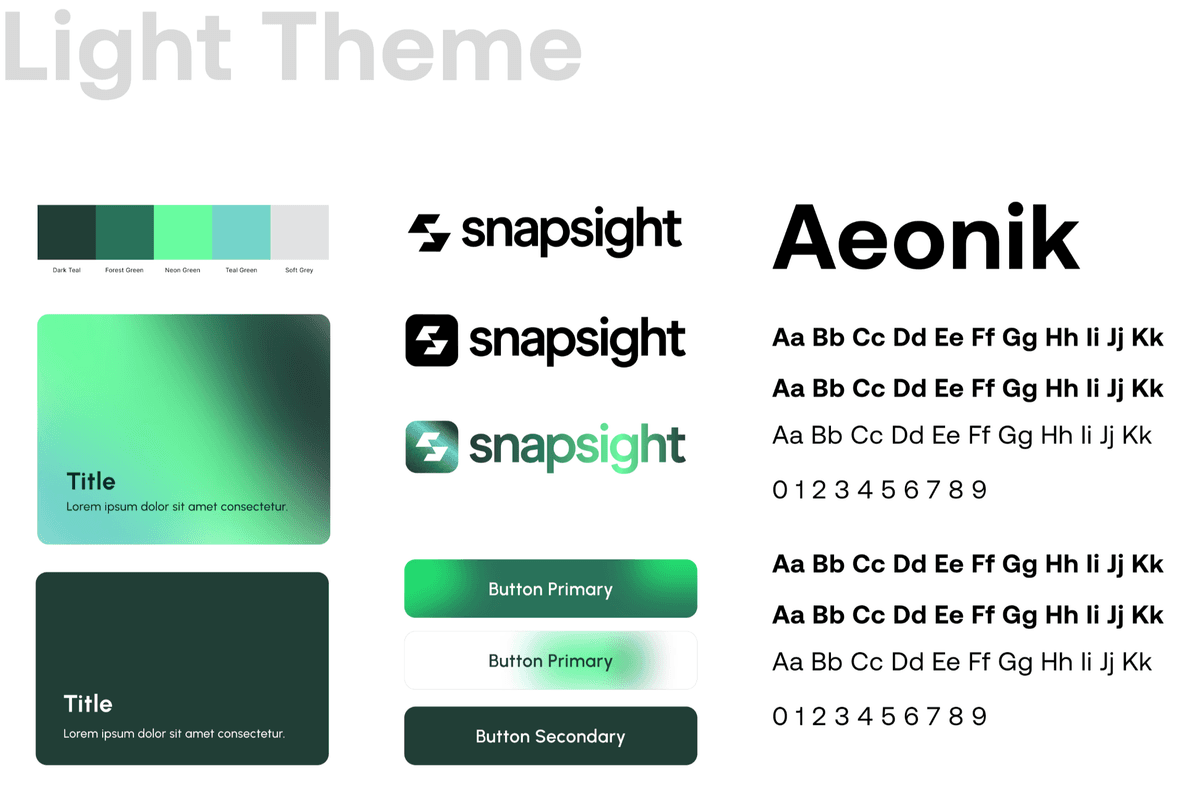
The original design used a dated blue-and-white palette with stock photography. We developed a new visual system: dark-mode primary with a signature accent, custom data visualisation components as decorative elements, and a motion language that implied intelligence without being gimmicky.
UX Copywriting: Clarity Over Cleverness
Rewrote all body copy, CTA labels, and feature descriptions to focus on buyer outcomes rather than product capabilities. Replaced "AI-powered sentiment engine" with "Know exactly how your audience felt — instantly." Every CTA now states the next concrete step, not an abstract invitation.
Design System for Maintainability
Built a Figma component library the marketing team could extend without breaking the visual system. Created a Framer CMS structure so blog posts, case studies, and feature pages could be added by non-designers — reducing design dependency for content updates.
Results
Measured against a 90-day pre-launch baseline. The redesign launched in April 2025.
Attributed by the Snapsight team to improved website clarity and demo conversion improvements.
CTA optimisation and clearer value hierarchy drove more qualified enterprise leads to the sales pipeline.
Visitors stayed longer and explored more pages — the new IA made the product story clearer to follow.
Your project next
Let's build something worth remembering.
Tell us what you're building and we'll come back with a plan, a timeline, and a price.