AppX Creator
Dashboard
AppX (Y Combinator S21) was struggling with declining engagement on a creator dashboard used by over a million users. Through deep discovery, workflow simplification, and a rebuilt design system, we drove a 43% engagement lift without adding a single new feature.
The Brief
AppX is a Y Combinator-backed EdTech platform that lets educators and creators build online courses, membership sites, and digital products. After their Series A raise, the creator dashboard — the core product surface — was visibly straining under its own growth.
The product had been built fast. Features were layered without a coherent information architecture, navigation patterns were inconsistent across platforms, and creators were increasingly writing in to support to do things that should have taken two clicks.
We're not missing features — creators just can't find what we've already built.
— AppX Head of Product
We joined as the product design team responsible for the creator-facing product, working embedded in a cross-functional squad with two engineers, a PM, and growth analysts.
The mandate: diagnose the usability issues, design a new system from the ground up, and ship iteratively without disrupting the 1M+ users already in-product daily.
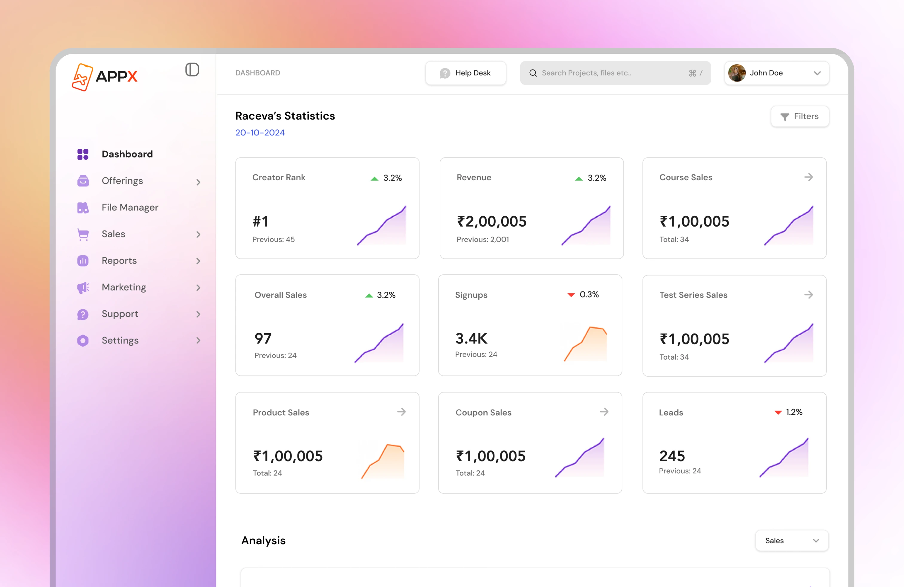
Problems Identified
Fragmented Navigation
Critical actions were buried 3–4 levels deep. New creators couldn't find core features without contacting support.
Data Overload
The analytics view surfaced every metric simultaneously with no hierarchy — creators had no idea what to act on.
Broken Mobile UX
The mobile app was a direct port of the desktop UI — touch targets were too small, flows were non-linear, key actions were inaccessible.
No Design System
Components were inconsistent across screens. Engineers and designers worked from different mental models — handoff was a recurring source of bugs.
Onboarding Drop-off
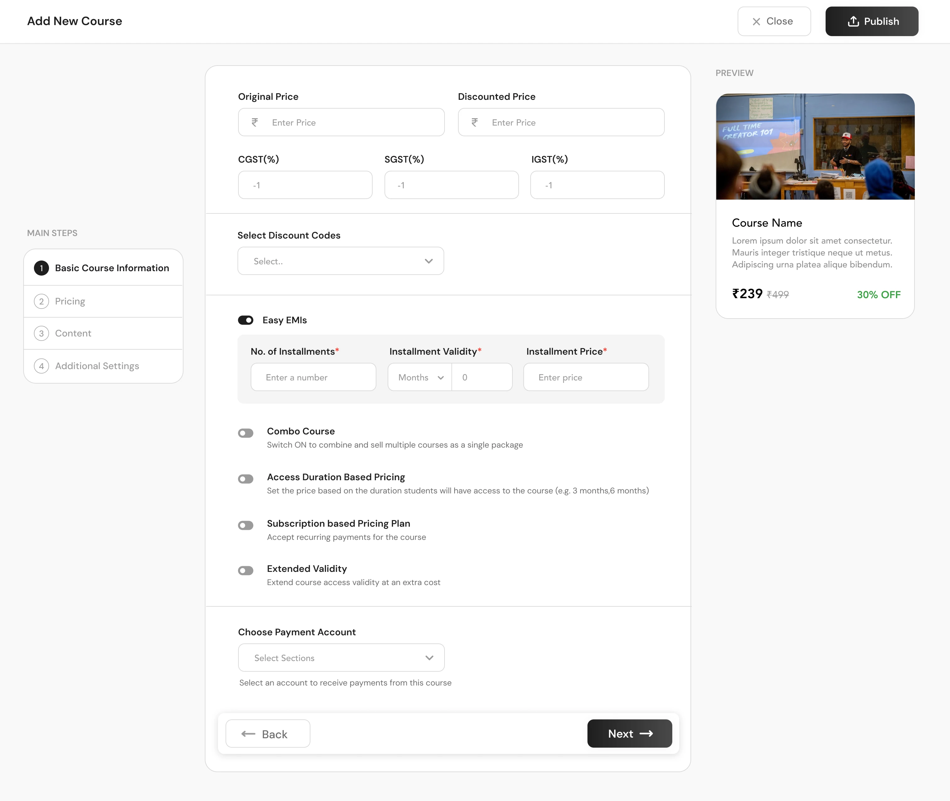
Heatmap analysis revealed 67% of new creators abandoned during the first course setup flow — a 7-step form with no progress indication.
Repetitive Support Load
65% of support tickets were for tasks the product already supported — a pure UX discoverability problem, not a feature gap.
Design Process
Discovery & Research
Conducted 12 moderated user interviews with creators across verticals (education, fitness, business coaching). Reviewed 3 months of Hotjar recordings to identify rage-click hotspots and drop-off patterns. Analysed support ticket themes with the CX team to create a quantified problem stack.
Information Architecture Overhaul
Card-sorted the full feature set with 20 existing creators to identify their mental models. Restructured the IA around three core jobs-to-be-done: Create, Manage, and Grow. Reduced primary navigation depth from 4 levels to 2.
Design System Foundation
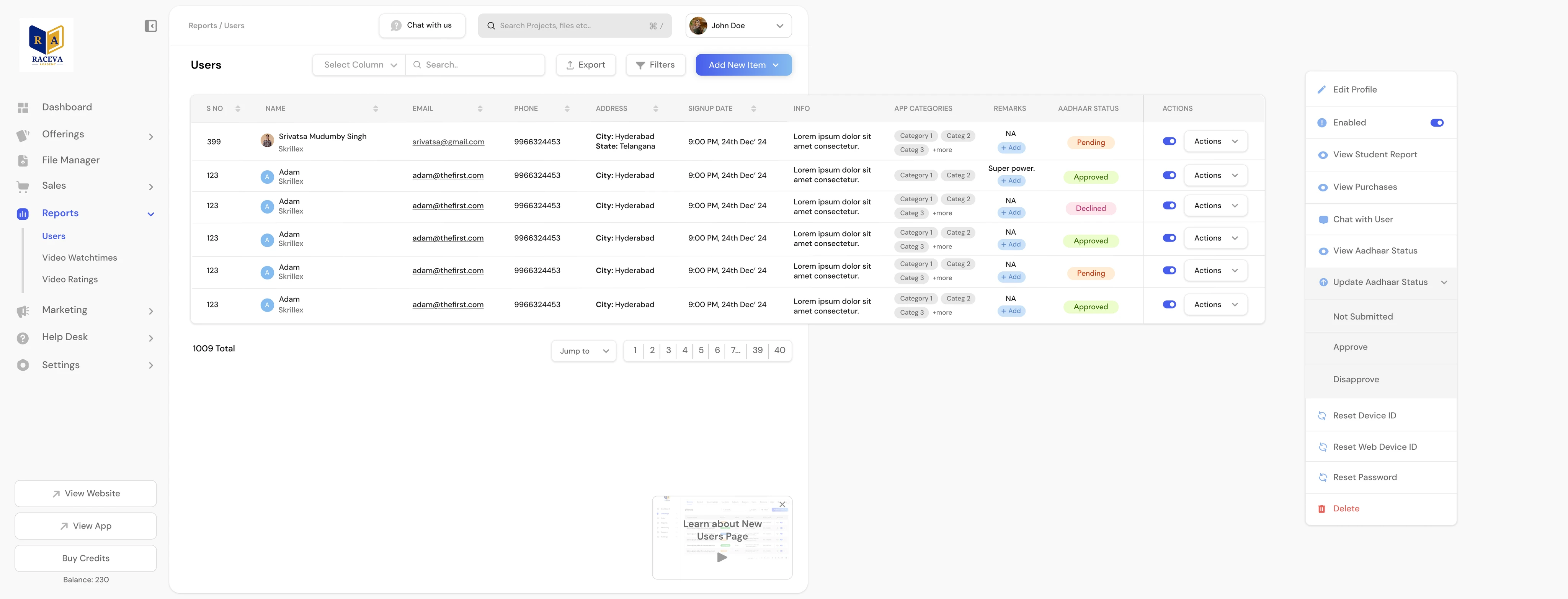
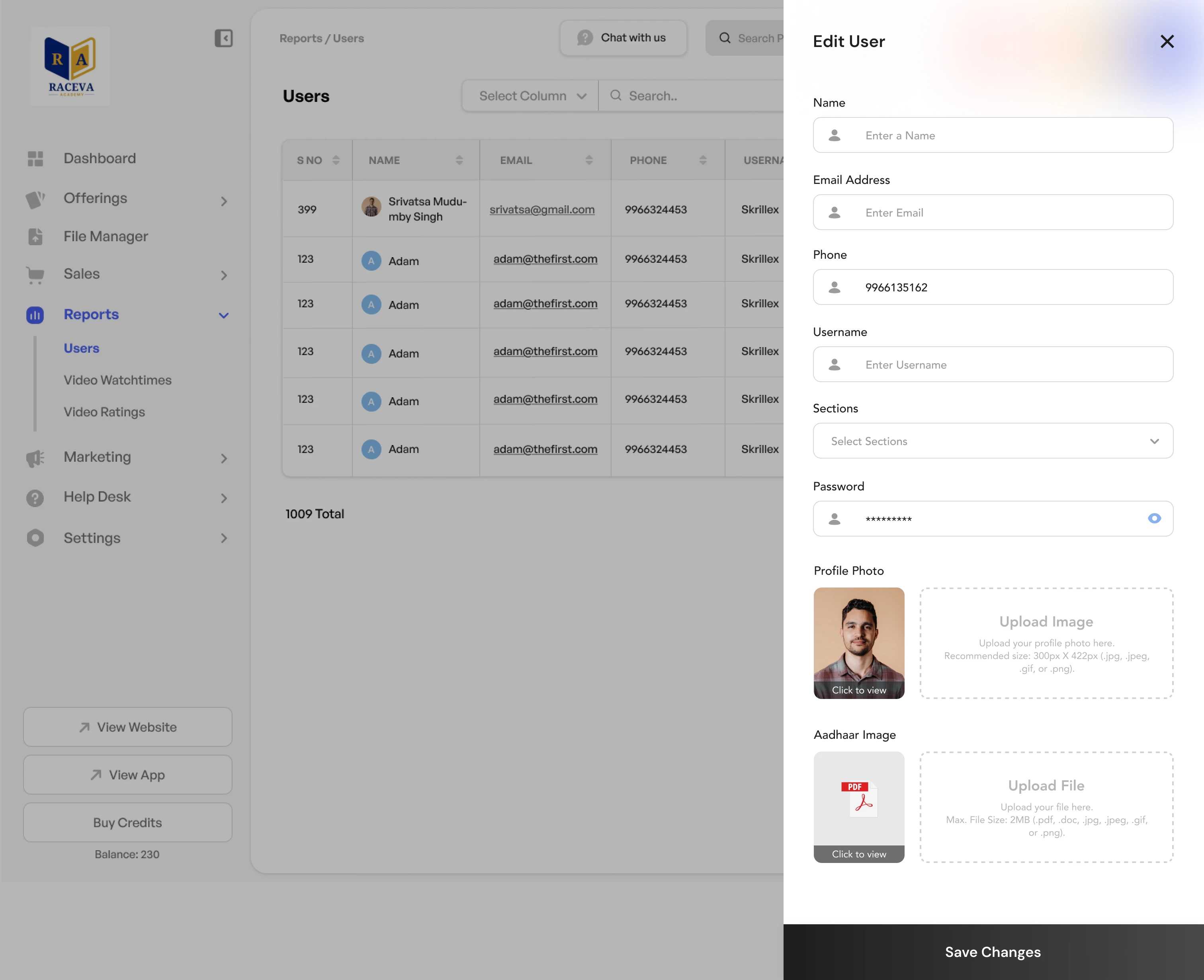
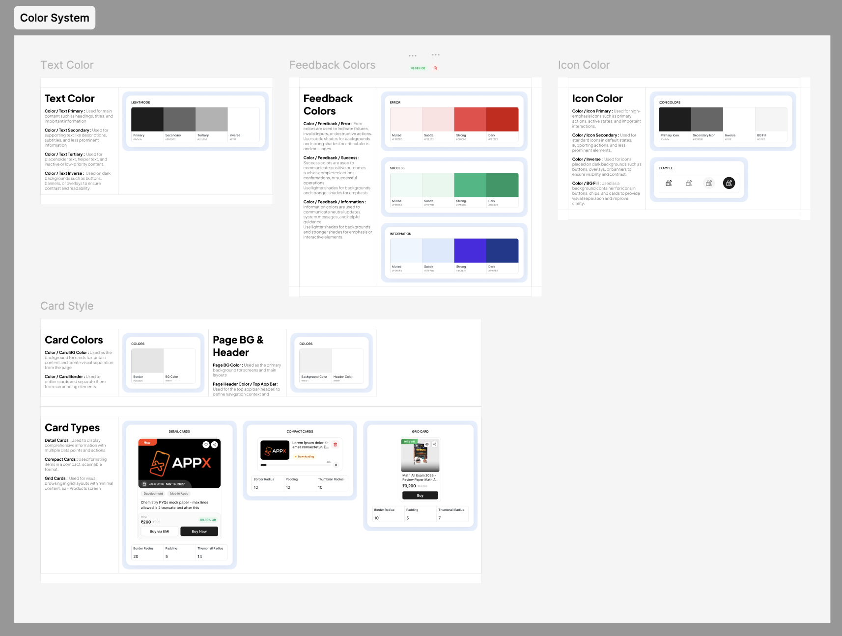
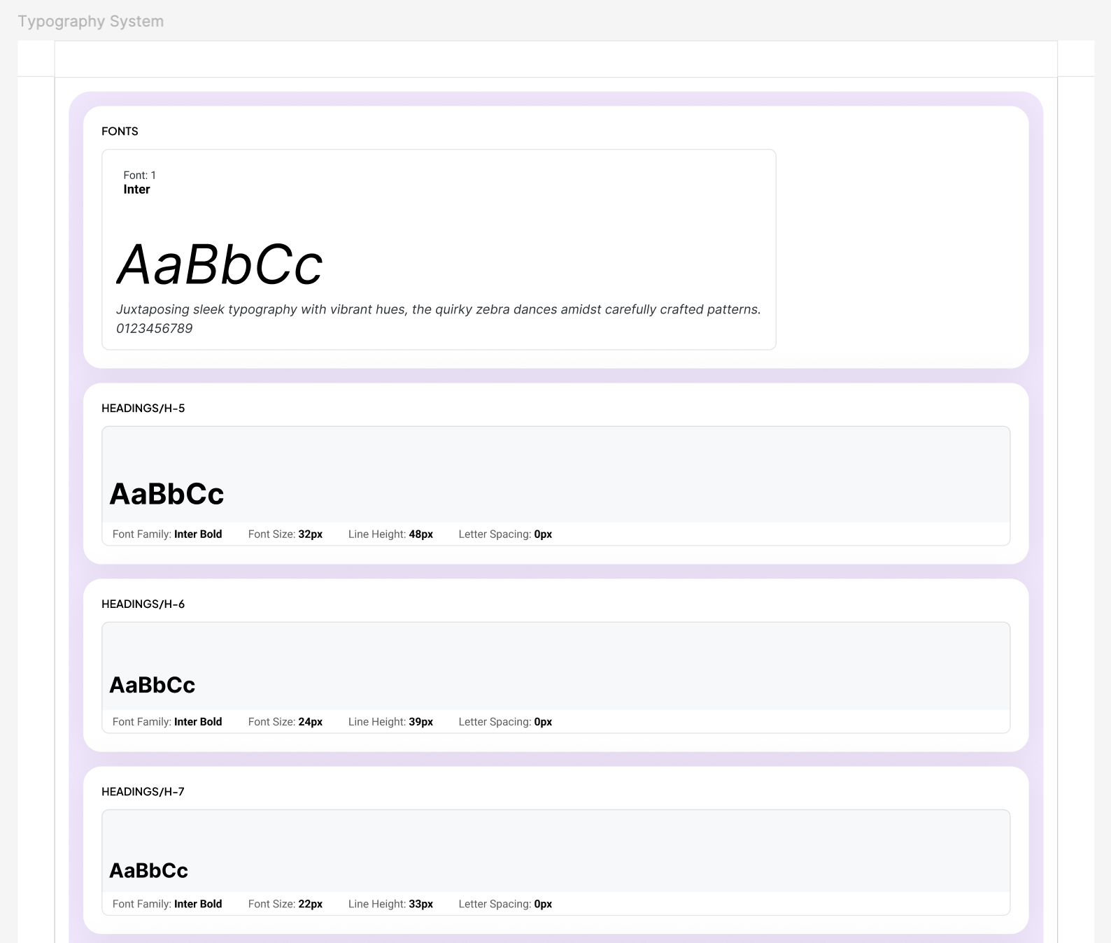
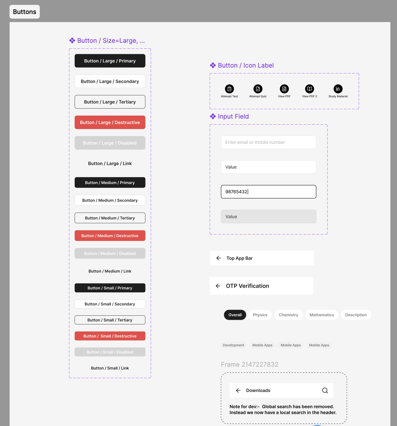
Built a component library from scratch in Figma — covering 60+ components with variants, states, and accessibility annotations. Established design tokens (colour, spacing, typography) mapped to CSS variables for dev handoff in Figma Dev Mode.
Prototyping & Usability Testing
Built interactive high-fidelity prototypes for the 5 highest-impact flows. Ran two rounds of unmoderated usability tests (n=30 per round via Maze) and iterated on findings before dev handoff. Task completion rate moved from 58% to 91% on core flows.
Agile Delivery & Iteration
Shipped in 6 two-week sprint cycles alongside two engineers. Used feature flags to roll out changes progressively, monitoring engagement and error rates per feature. Maintained a living design spec with inline Loom annotations for complex interactions.
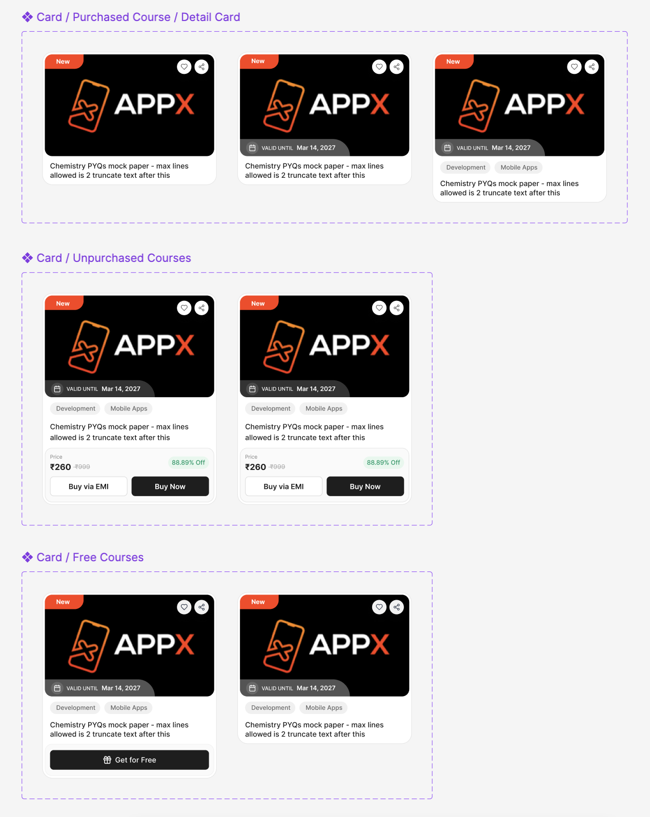
The Design System
The component library came before the screens. Foundations for colour, type, and interaction meant every surface across web, iOS and Android could be built from the same parts — and engineers stopped re-implementing the same patterns.
Impact & Results
Measured over a 90-day post-launch window across the full creator base. Feature flags allowed us to A/B test the new dashboard flows against the legacy UI before full rollout.
Average daily active session time up from 8.2 to 11.7 minutes. Creators were completing more tasks per session.
Discoverability-related tickets dropped sharply after launch — the biggest single quarter improvement for the CX team.
Core flow completion (course setup, payout, student management) improved from 58% to 91% in usability testing.
Key Learnings
Talk to support before you talk to users
Support ticket analysis gave us a quantified problem stack in hours — more actionable than any heuristic audit. The CX team knew exactly where the UX broke.
The design system is the product
Building the component library first, before designing screens, meant every surface felt coherent. It also cut dev handoff friction significantly — engineers stopped re-implementing the same patterns.
Iterative feature flags over big-bang launches
Rolling out new flows to 5% of users first let us catch edge cases before they affected the full creator base. The launch felt calm because we had live feedback throughout.
Mobile-first forces better decisions
Designing for touch targets and small screens first eliminated a lot of feature sprawl. If something couldn't be done in 2 taps on mobile, it wasn't ready to ship anywhere.
Your project next
Let's build something worth remembering.
Tell us what you're building and we'll come back with a plan, a timeline, and a price.