ReplylessAI
Inbox Workspace
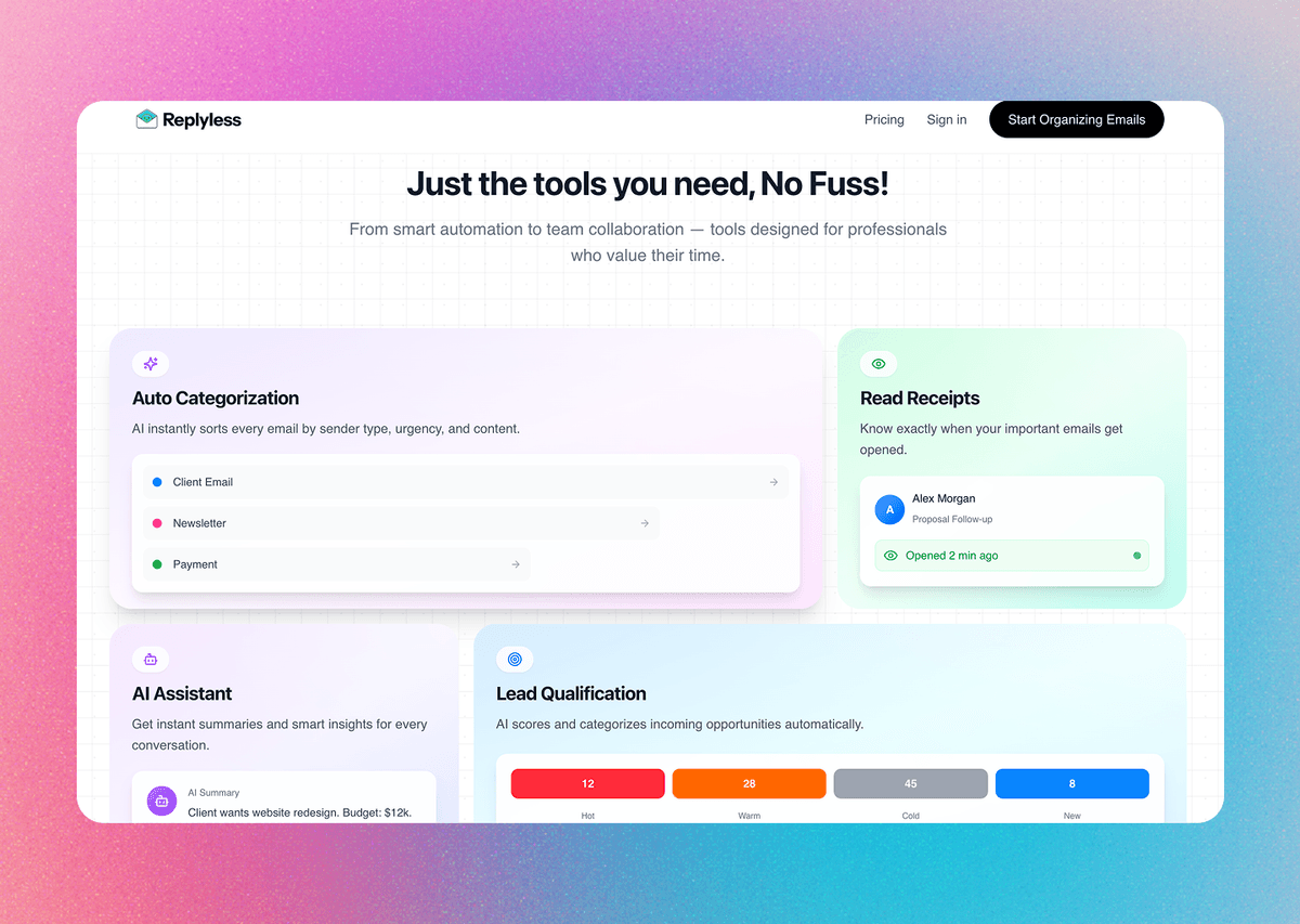
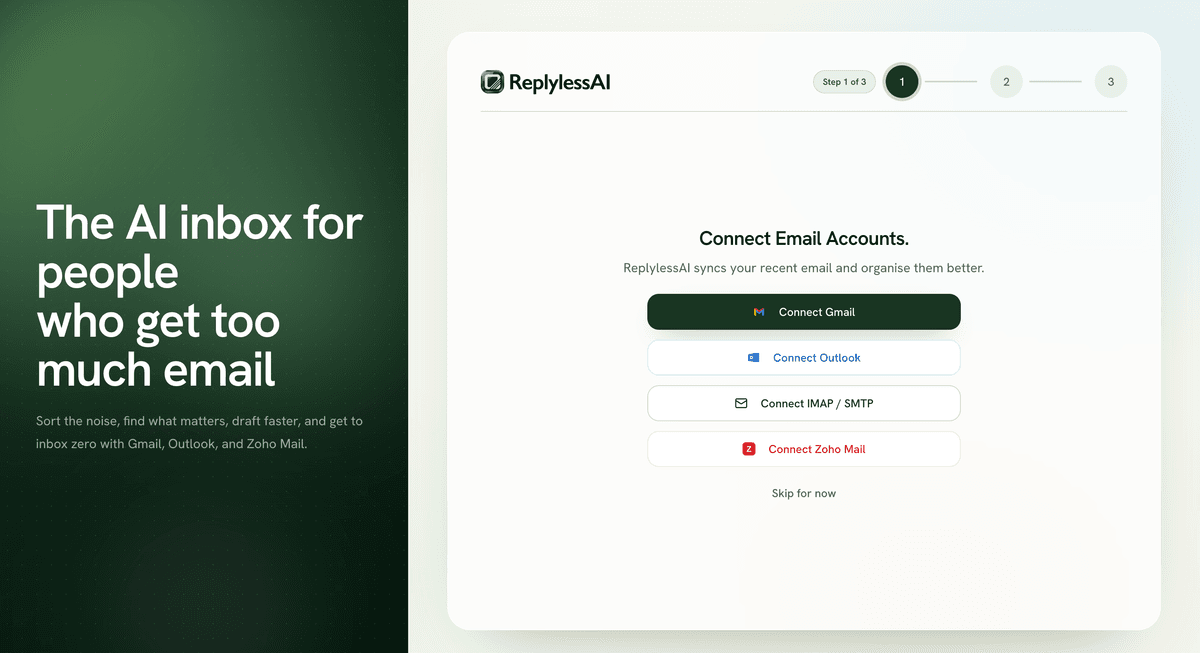
ReplylessAI is an AI-first email workspace designed to help busy professionals process inboxes faster. We designed the product experience and marketing surface around one idea: make email feel organised, actionable, and calm instead of like a backlog you never catch up to.
Visit liveThe Opportunity
Email still runs a huge part of professional work, but the core interface hasn't really changed. Important client threads, payments, newsletters, and updates all arrive in the same place and demand the same visual attention.
ReplylessAI was designed around a simpler product promise: automatically separate what matters, shorten the path to action, and let AI help without turning the inbox into a black box.
The inbox isn't broken because email is old. It's broken because everything looks equally urgent.
— ReplylessAI product thesis
We approached it as a workflow product, not just a prettier mail client. The design had to help users scan faster, trust the system's categorisation, and take action with less cognitive overhead.
Core audience: founders, freelancers, and operators managing high volumes of mixed-priority email every day.
Core Design Decisions
Categorise by Intent, Not by Generic Labels
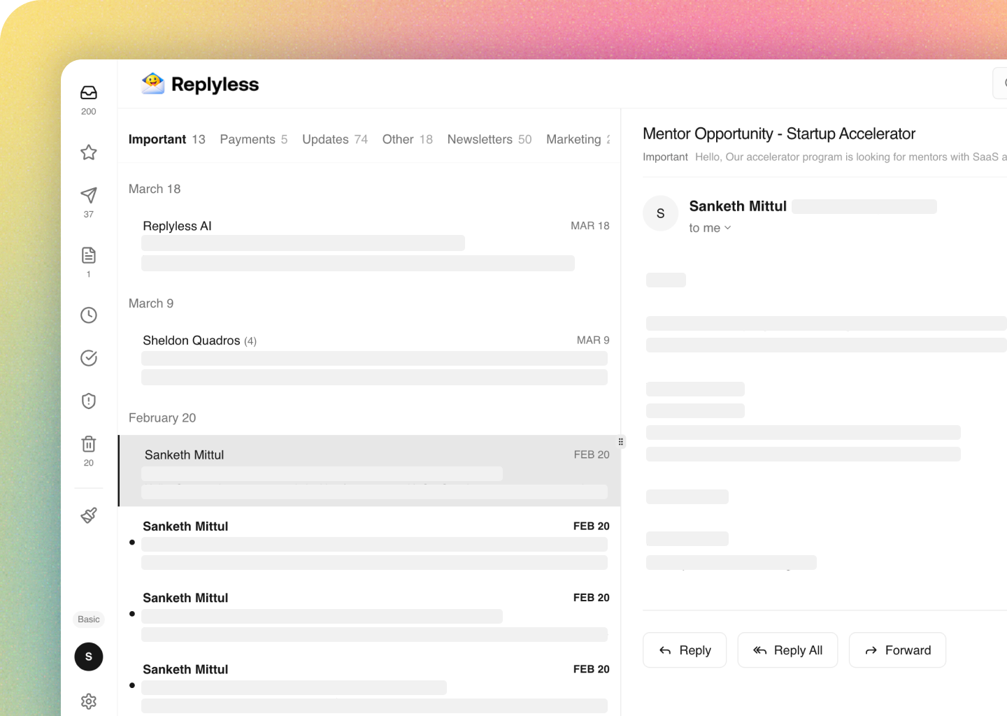
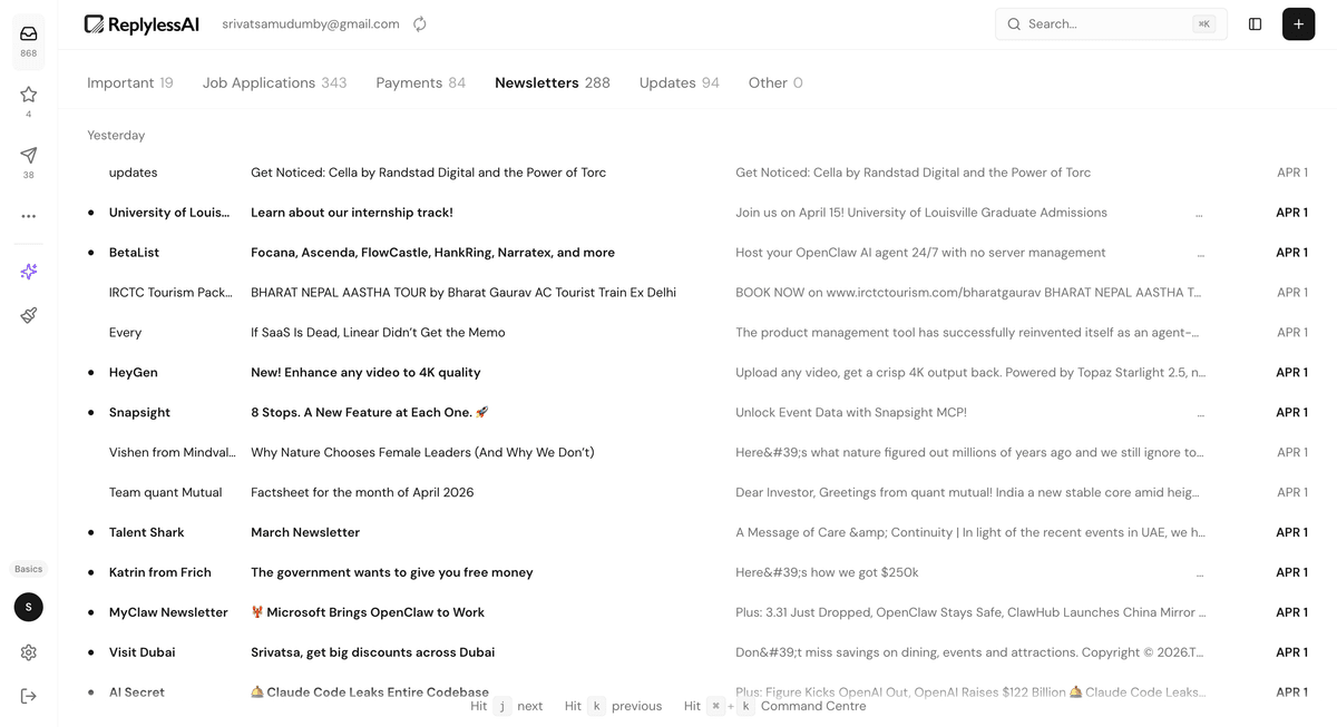
Instead of forcing users into a traditional unread/starred/archive workflow, we designed the inbox around real-world mental buckets: Important, Job Applications, Payments, Newsletters, Updates, and Other. This gives structure immediately and reduces the "where do I even start?" problem.
Keep Action Near the Message
Quick actions like remind, complete, and delete live where the user is already looking. The goal was to remove toolbar hunting and make triage feel lightweight enough to do continuously instead of in long cleanup sessions.
Make AI Feel Like a Collaborator
The AI assistant was designed as an on-demand layer over the inbox, not a takeover. Users can search messages, find tasks, draft replies, and summarise threads inside a familiar chat surface while still keeping the original email context visible.
Balance Utility With a Product Worth Trying
The visual direction uses soft gradients, light surfaces, and simple iconography to make a productivity tool feel approachable. The website and product were designed to tell the same story: this is serious software, but it should still feel easy to start using.
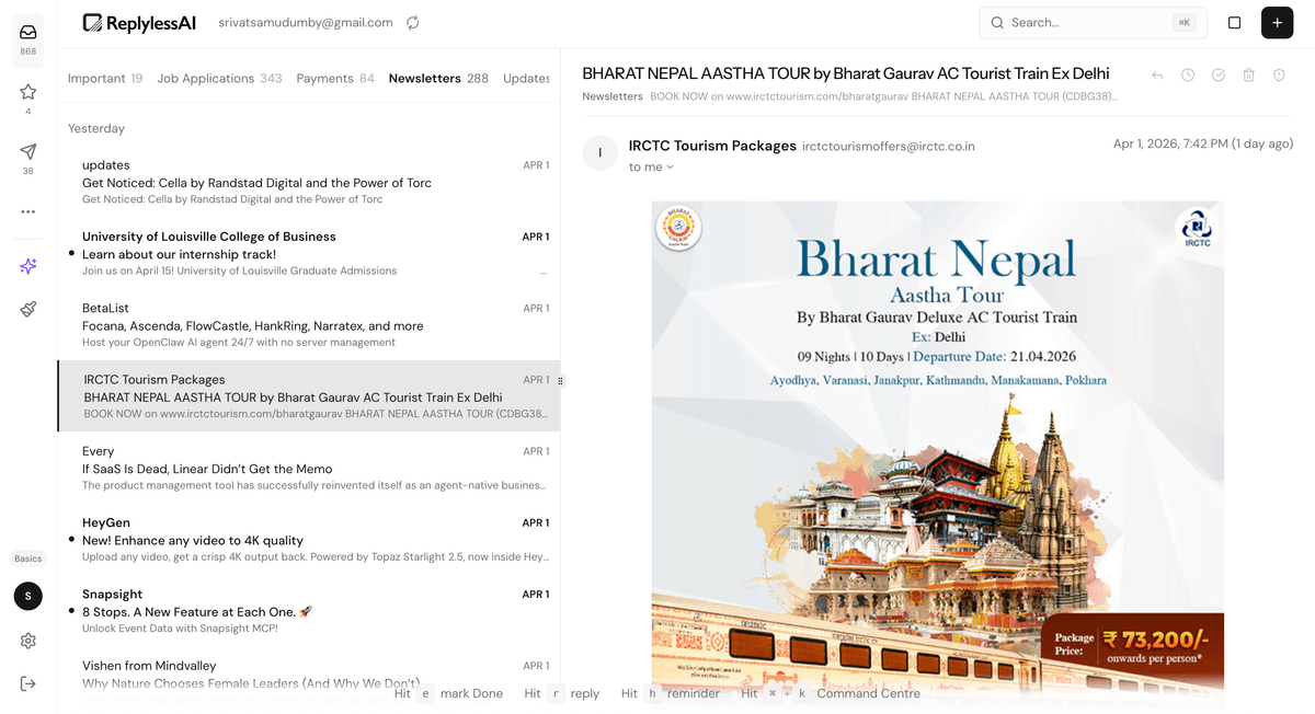
Product Value
The category system helps users understand their inbox at a glance instead of reading every sender and subject line equally.
Key actions are surfaced inline so common tasks feel immediate, reducing the friction of processing messages one by one.
The assistant supports the user without hiding the original inbox, making the experience feel more trustworthy and controllable.
Key Learnings
AI needs a clear job
The strongest AI moments were specific: summarise, search, draft, and surface follow-ups. Broad "assistant" positioning feels vague unless the UI anchors it in real user tasks.
Categorisation creates calm
The biggest UX win wasn't animation or novelty. It was immediately reducing visual noise so users could tell what mattered and what could wait.
Product and marketing should tell one story
The landing page and app visuals work best when they reinforce the same mental model. What users see on the homepage should match the benefit they feel after onboarding.
Utility can still feel polished
Inbox software doesn't have to look cold or purely functional. A calmer visual system made the product feel more inviting without getting in the way of speed.
Your project next
Let's build something worth remembering.
Tell us what you're building and we'll come back with a plan, a timeline, and a price.